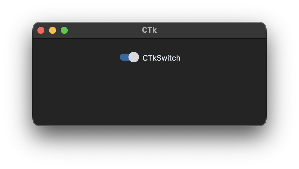
CTkSwitch
Example Code
def switch_event():
    print("switch toggled, current value:", switch_var.get())

switch_var = customtkinter.StringVar(value="on")
switch = customtkinter.CTkSwitch(app, text="CTkSwitch", command=switch_event,
                                 variable=switch_var, onvalue="on", offvalue="off")
Arguments
| argument | value |
|---|---|
| master | master widget |
| width | width of complete widget in px |
| height | height of complete widget in px |
| switch_width | width of switch in px |
| switch_height | height of switch in px |
| corner_radius | corner radius in px |
| border_width | box border width in px |
| button_length | length of the switch button in px, 0 makes it round |
| bg_color | color behind the widget, only visible at the rounded corners, "transparent" (default) takes the color of the parent widget, tuple: (light_color, dark_color) or single color |
| fg_color | foreground (inside) color, tuple: (light_color, dark_color) or single color |
| border_color | border color, tuple: (light_color, dark_color) or single color or "transparent" default is "transparent" |
| progress_color | color of switch when enabled, tuple: (light_color, dark_color) or single color or "transparent" |
| button_color | color of button, tuple: (light_color, dark_color) or single color |
| button_hover_color | hover color of button, tuple: (light_color, dark_color) or single color |
| text_color | text color, tuple: (light_color, dark_color) or single color |
| text_color_disabled | text color when disabled, tuple: (light_color, dark_color) or single color |
| text | string |
| textvariable | Tkinter StringVar to control the text |
| font | button text font, tuple: (font_name, size) |
| command | function will be called when the checkbox is clicked or .toggle() is called |
| variable | Tkinter variable to control or read checkbox state |
| onvalue | string or int for variable in checked state |
| offvalue | string or int for variable in unchecked state |
| hover | enable/disable hover effect: True, False |
| state | "normal" (standard) or "disabled" (not clickable) |
Arguments and methods that all widgets share, like bg_color, .bind(), .focus() or .destroy(), are described on Common arguments and methods.
Methods
-
.configure(attribute=value, ...)
All attributes can be configured and updated, for example:
switch.configure(state="disabled") -
.cget(attribute_name)
Pass attribute name as string and get current value of attribute.
-
.get()
Get current value of switch, 1 or 0 (checked or not checked).
-
.set(state)
Switch on (
True) or off (False), the command will not be triggered. (new in 6.0) -
.select()
Turn on switch (set value to 1), command will not be triggered.
-
.deselect()
Turn off switch (set value to 0), command will not be triggered.
-
.toggle()
Flip current value of switch, command will be triggered.