CTkLabel
Example Code
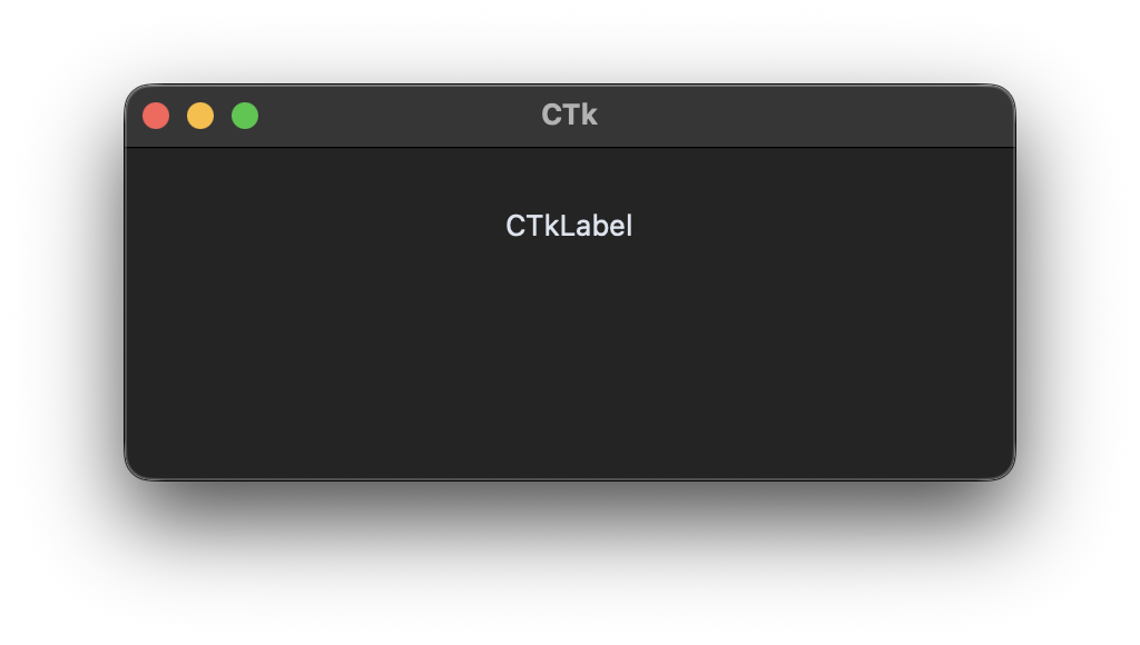
label = customtkinter.CTkLabel(app, text="CTkLabel", fg_color="transparent")
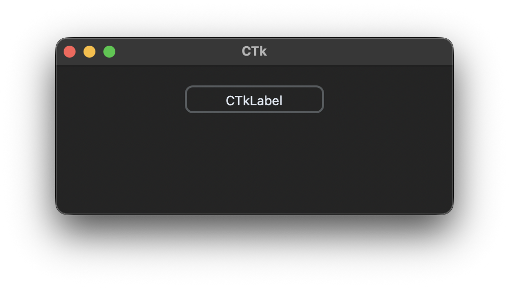
With a border (new in 6.0):
label = customtkinter.CTkLabel(app, text="CTkLabel", corner_radius=8, border_width=2)
Arguments
| argument | value |
|---|---|
| master | root, tkinter.Frame or CTkFrame |
| textvariable | tkinter.StringVar object |
| text | string |
| width | label width in px |
| height | label height in px |
| corner_radius | corner radius in px |
| border_width | border width in px, default is 0 (new in 6.0) |
| bg_color | color behind the widget, only visible at the rounded corners, "transparent" (default) takes the color of the parent widget, tuple: (light_color, dark_color) or single color |
| fg_color | foreground color, tuple: (light_color, dark_color) or single color or "transparent" |
| border_color | border color, tuple: (light_color, dark_color) or single color (new in 6.0) |
| text_color | label text color, tuple: (light_color, dark_color) or single color |
| text_color_disabled | text color when the label is disabled with state="disabled", tuple: (light_color, dark_color) or single color |
| font | label text font, tuple: (font_name, size) |
| image | CTkImage that is displayed in the label, see compound for the position relative to the text |
| anchor | controls where the text is positioned if the widget has more space than the text needs, default is "center" |
| compound | control the postion of image relative to text, default is "center, other are: "top", "bottom", "left", "right" |
| justify | specifies how multiple lines of text will be aligned with respect to each other: "left" for flush left, "center" for centered (the default), or "right" for right-justified |
| padx | extra space added left and right of the text, default is 1 |
| pady | extra space added above and below the text, default is 1 |
| wraplength | maximum line length in px, longer text is wrapped onto the next line, 0 (default) means no wrapping |
| state | "normal" (standard) or "disabled", a disabled label uses text_color_disabled |
The label also accepts these arguments of tkinter.Label: cursor, takefocus and underline.
Arguments and methods that all widgets share, like bg_color, .bind(), .focus() or .destroy(), are described on Common arguments and methods.
Methods
-
.configure(attribute=value, ...)
All attributes can be configured, for example:
label.configure(text="new text") -
.cget(attribute_name)
Pass attribute name as string and get current value of attribute, for example:
text = label.cget("text") -
.bind(sequence=None, command=None, add=None)
Bind events to the label.