CTkButton
Available since version 0.3.0.
Example Code
def button_event():
    print("button pressed")

button = customtkinter.CTkButton(app, text="CTkButton", command=button_event)
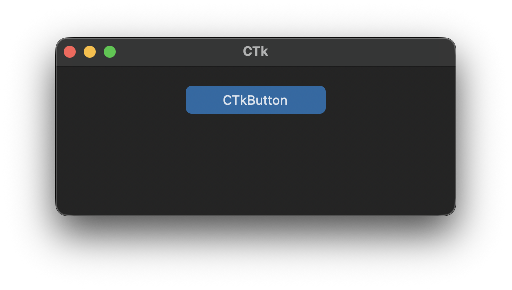
Changed in 6.0
The command is now called when the mouse button is released over the button, not when it is pressed. Moving the mouse away before releasing cancels the click, like with native buttons.
Arguments
| argument | value |
|---|---|
| master | root, tkinter.Frame or CTkFrame |
| width | button width in px |
| height | button height in px |
| corner_radius | corner radius in px |
| border_width | button border width in px |
| border_spacing | spacing between text and image and button border in px, default is 2 |
| bg_color | color behind the widget, only visible at the rounded corners, "transparent" (default) takes the color of the parent widget, tuple: (light_color, dark_color) or single color |
| fg_color | forground color, tuple: (light_color, dark_color) or single color or "transparent" |
| hover_color | hover color, tuple: (light_color, dark_color) or single color |
| border_color | border color, tuple: (light_color, dark_color) or single color |
| text_color | text color, tuple: (light_color, dark_color) or single color |
| text_color_disabled | text color when disabled, tuple: (light_color, dark_color) or single color |
| background_corner_colors | tuple of four colors for the background behind the corners (top left, top right, bottom right, bottom left), useful if the button sits between differently colored areas, default is None |
| round_width_to_even_numbers | round the drawn width to even numbers for crisper shapes, default is True |
| round_height_to_even_numbers | round the drawn height to even numbers for crisper shapes, default is True |
| text | string |
| font | button text font, tuple: (font_name, size), (set negative size value for size in pixels) |
| textvariable | tkinter.StringVar object to change text of button |
| image | put an image on the button, removes the text, must be class PhotoImage |
| state | "normal" (standard) or "disabled" (not clickable, darker color) |
| hover | enable/disable hover effect: True, False |
| command | function will be called when the button is clicked; since 6.0 the command is called when the mouse button is released over the button |
| compound | set image orientation if image and text are given ("top", "left", "bottom", "right") |
| anchor | alignment of text an image in button ("n", "ne", "e", "se", "s", "sw", "w", "nw", "center") |
Arguments and methods that all widgets share, like bg_color, .bind(), .focus() or .destroy(), are described on Common arguments and methods.