Color and Themes
Color
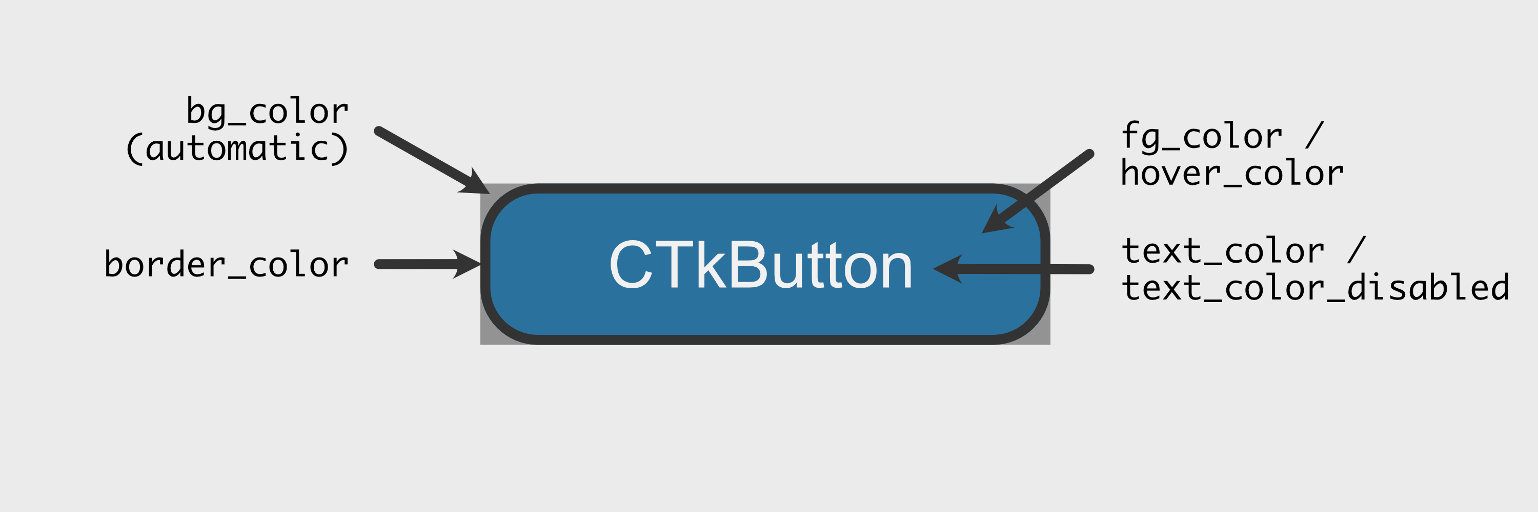
All colors of the widgets can be customised, the appropriate arguments can be found in the documentation of the specific widgets. Note that bg_color is only the color behind the widget if it has rounded corners. The main color of a widget is called fg_color:
The colors can either be set to a single color name ("red"), a single hex color string ("#FF0000") or a tuple color for a light mode color and dark mode color (("red", "darkred")). The current color will then be picked by the widget automatically according to the current appearance mode. So by using the tuple color, the widgets can have different colors in light and dark appearance mode. If you use a single color then this color will be used for both light and dark appearance mode.
Example:
button = customtkinter.CTkButton(root_tk, fg_color="red")  # single color name
button = customtkinter.CTkButton(root_tk, fg_color="#FF0000")  # single hex string
button = customtkinter.CTkButton(root_tk, fg_color=("#DB3E39", "#821D1A"))  # tuple color
Themes
By default all colours are set by the color theme. Currently there a three themes available: "blue", "dark-blue" and "green", where "blue" is the standard theme. All themes provide tuple colors for a light and dark appearance mode.
You can set the theme at the beginning of your programming like the following:
customtkinter.set_default_color_theme("dark-blue") # Themes: "blue" (standard), "green", "dark-blue"
Custom Themes
A theme is described by a .json file like this: dark-blue.json.
You can also create your own theme, so that you don't have to set the styling for every widget manually. Just copy the .json file above and change the values. Then you can load the new theme by passing the path to your .json file to the .set_default_color_theme method:
customtkinter.set_default_color_theme("path/to/your/custom_theme.json")